
Homepages that make people stop scrolling.
Real Amber Mint design work, page by page: custom layouts, sharp photography, smooth motion and clear calls to action, built mobile-first for local businesses across Canada and the US.
Real projects. Real results.
Three Amber Mint projects, shared without client names.
A bilingual website that tripled client inquiries for an immigration consulting firm
The challenge
The firm served clients in two languages, but its website did not reflect the quality of its service. Visitors needed to find the right immigration program quickly, in their own language, and trust the firm enough to get in touch.
What we built
- A custom designed bilingual website with matching English and Farsi versions of every page, including a right-to-left layout for Farsi
- A stronger UI and UX: clear navigation by immigration program, so each visitor finds their path in a few clicks
- Clear calls to action on every page leading to a consultation request or a phone call
- SEO in both languages: page titles, meta descriptions, clean headings and schema markup, so each program can be found on Google on its own
- Professional copywriting and licensed images throughout
Result
300%
Within 2 months of launch, incoming client inquiries grew by 300%.
A clear, modern website for an industrial engineering company in Ontario
The challenge
The company does complex technical work for industrial clients, but its website did not explain its services clearly or show how established it is. Decision makers at larger companies need to understand capabilities quickly and see proof before they make contact.
What we built
- A custom, professional website that explains each service line on its own page in plain language
- A structure built for B2B buyers: capabilities, industries served, project experience and a clear request-a-quote path
- SEO-ready pages for the technical services the company wants to be found for
- Professional copywriting that turns technical detail into clear benefits, plus licensed industrial images
Brand-perfect visual content for the GTA branch of a global water treatment company
The challenge
Working with a large international brand is demanding. Every piece of content has to follow a strict brand guide and corporate rules on logos, colours, typography, imagery and messaging, while still feeling fresh and local for customers in the GTA.
What we do
- We design anything visual the branch needs: graphic designs, motion graphics and video
- Every piece follows the brand guide exactly. Because we create brand identities and brand guides for our own clients, we know how they work and how to apply them with care
- Content that stays on brand and consistent across every channel, while speaking to local customers
Result
A steady flow of polished, fully on-brand content that meets the corporate standards of a global brand and has delivered strong results for the GTA branch.
Want results like these for your business?
Every design starts from your customers.
Hover a laptop to scroll through the full homepage, or open the live design to try it yourself on any device.
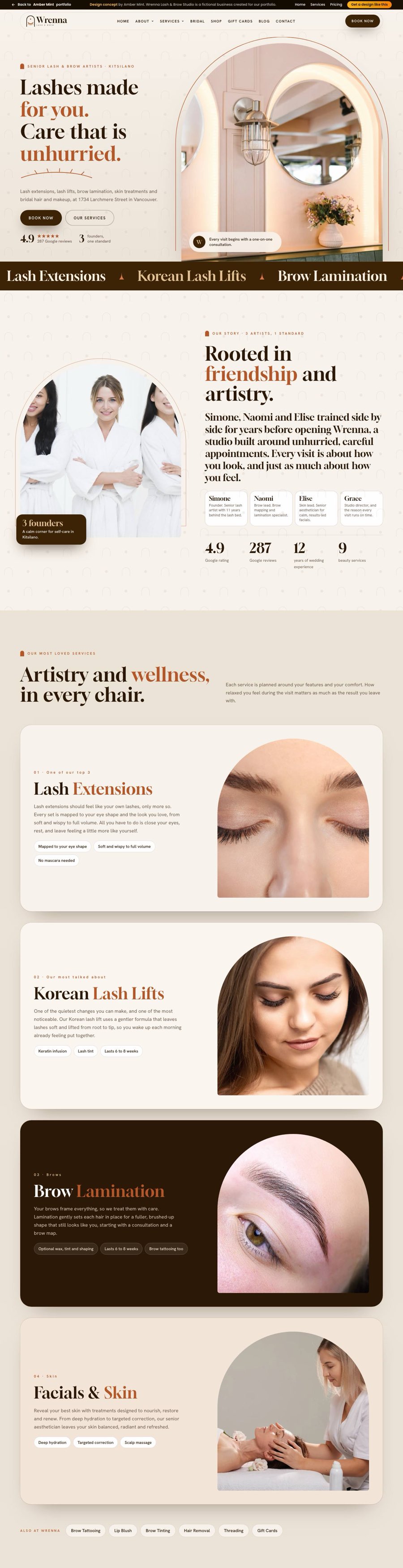
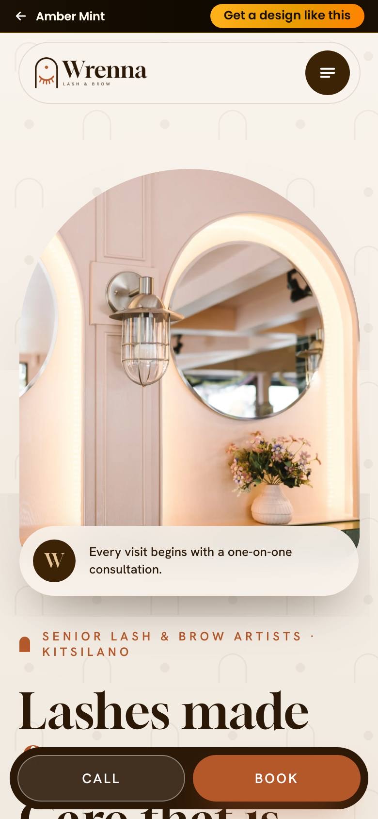
Wrenna Lash & Brow Studio
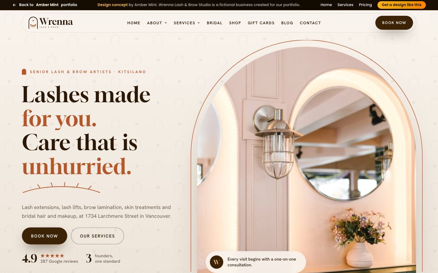
Soft arches, slow mornings, and lashes booked in one tap
A calm homepage design for a lash and brow studio, built around arches: an arched hero photo, arched team portraits and a soft arch pattern behind it all. Stacked service cards slide over each other on scroll, a warm espresso and rust palette keeps it premium, and a Book now button stays one tap away on any phone.
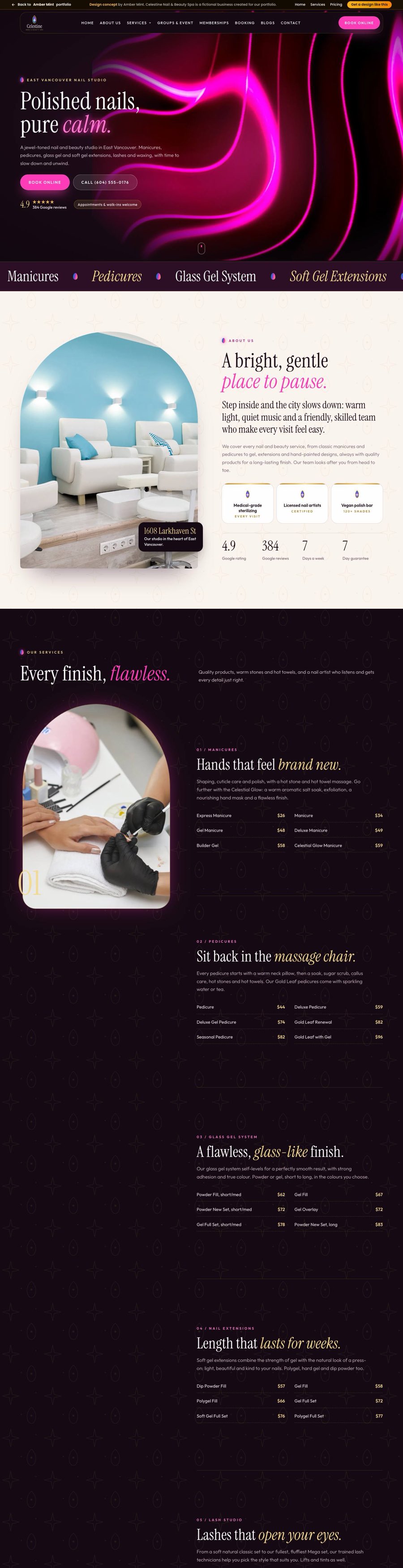
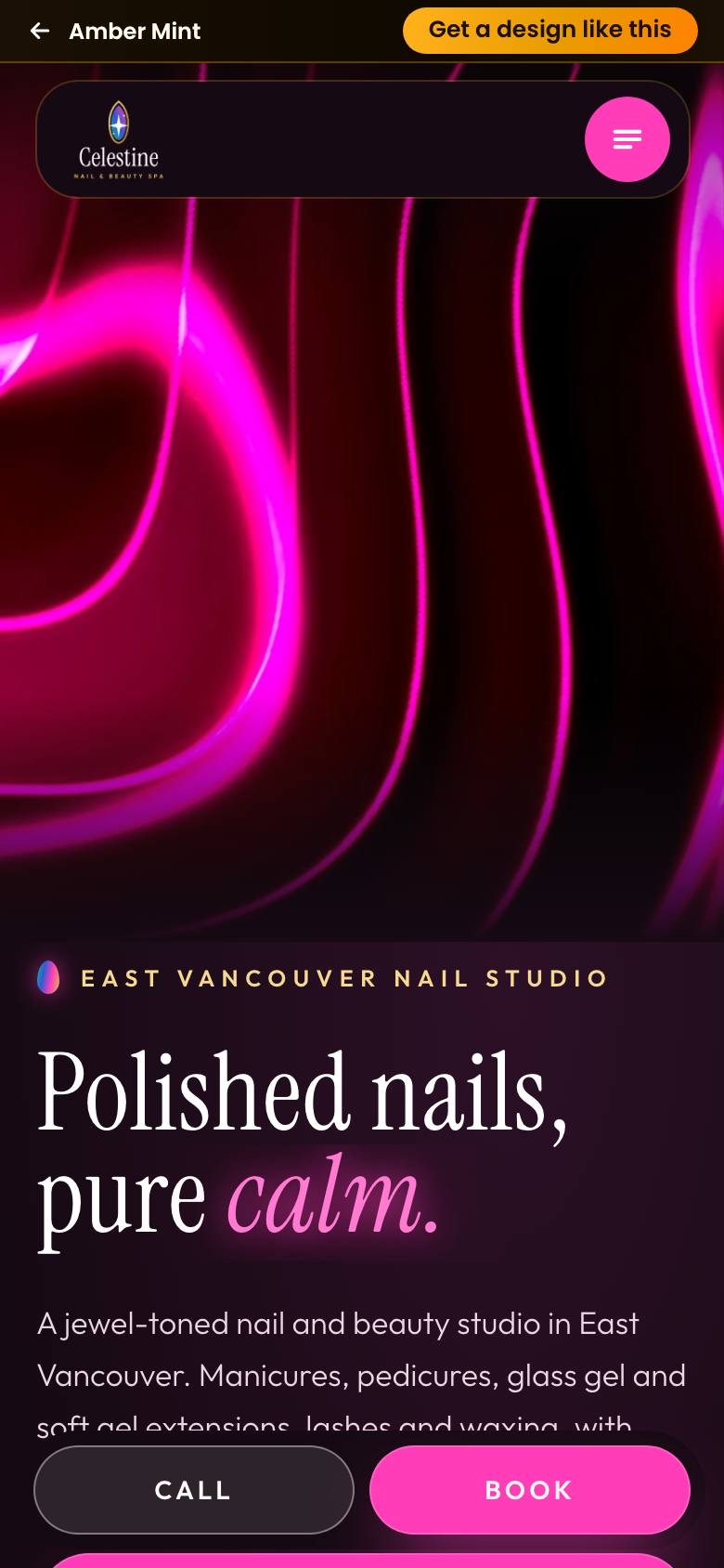
Celestine Nail & Beauty Spa
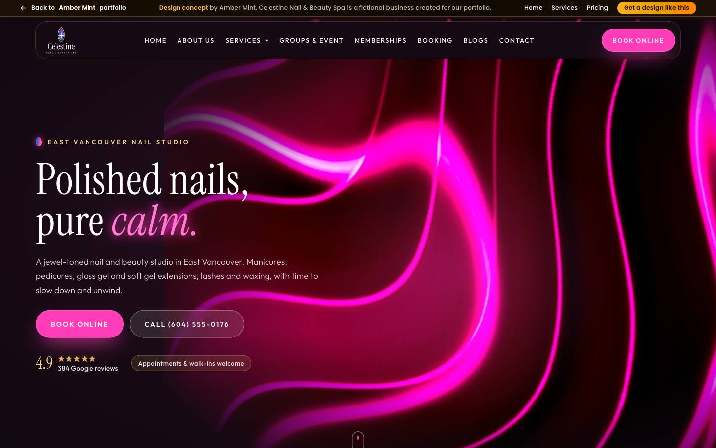
Neon glow outside, pure calm inside, every price in view
A jewel-toned homepage design for a nail and beauty spa, opening on a glowing neon hero set in an elegant serif. A sticky almond-shaped frame swaps photos as visitors scroll a long menu, so every price stays easy to scan. Deep plum, gold and pink keep it luxurious, while Book and Call buttons sit on every mobile screen.
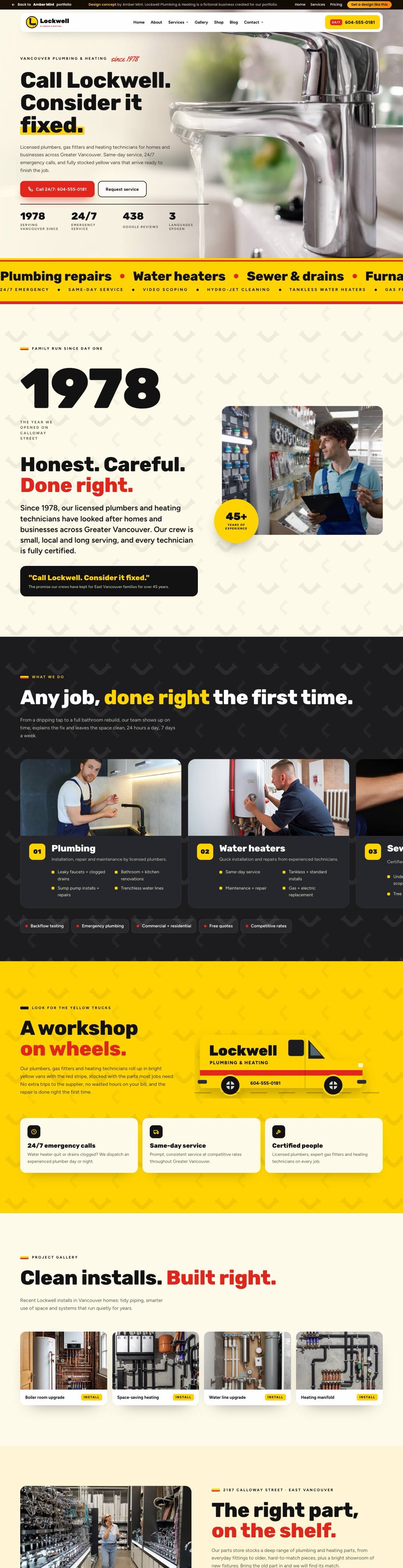
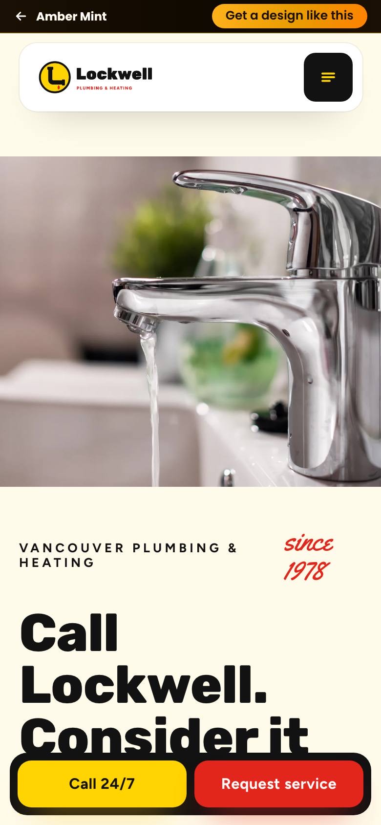
Lockwell Plumbing & Heating
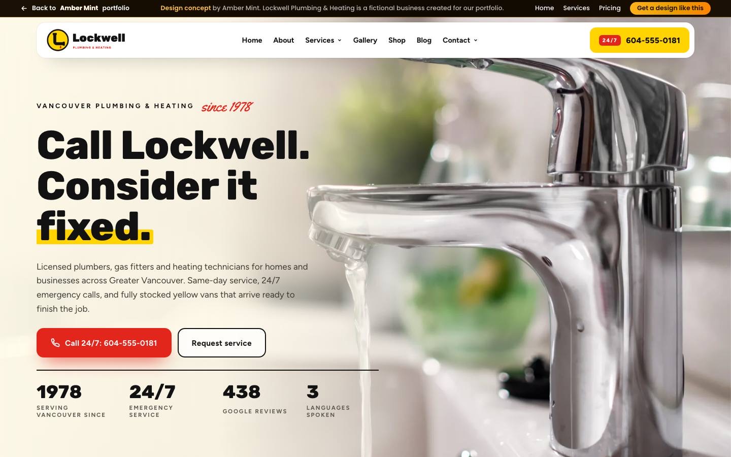
Flooded basement at midnight? One tap to the right plumber
A bold yellow, red and black homepage design for a family plumbing, heating and parts business. Heavy, friendly headlines build trust fast, while the 24/7 phone line and same-day service stay in reach on every screen. Service cards slide past on scroll, a branded van drives across the page, and a crisp parts store section serves contractors too.
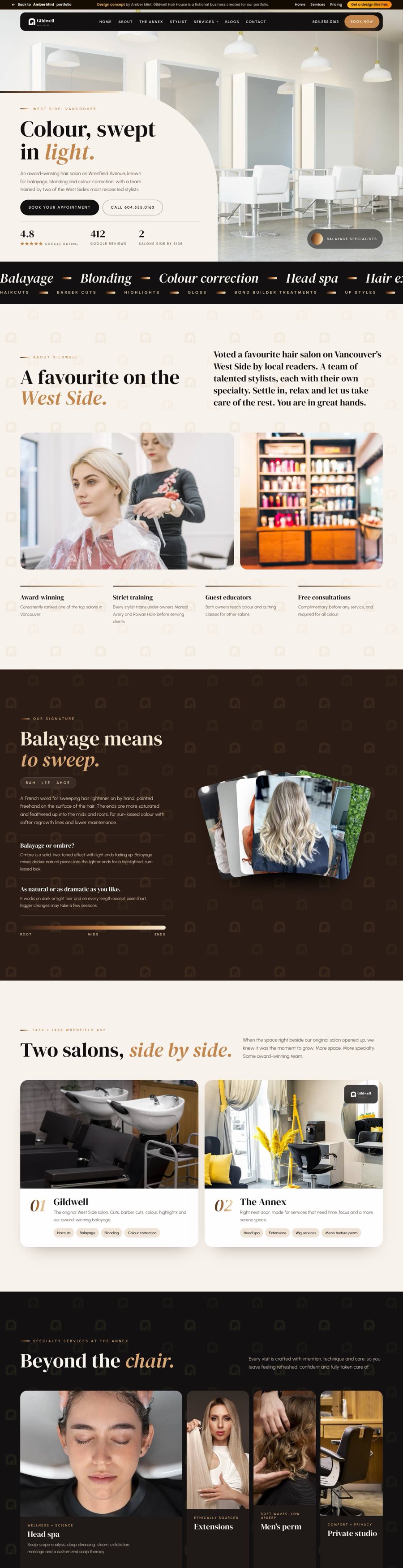
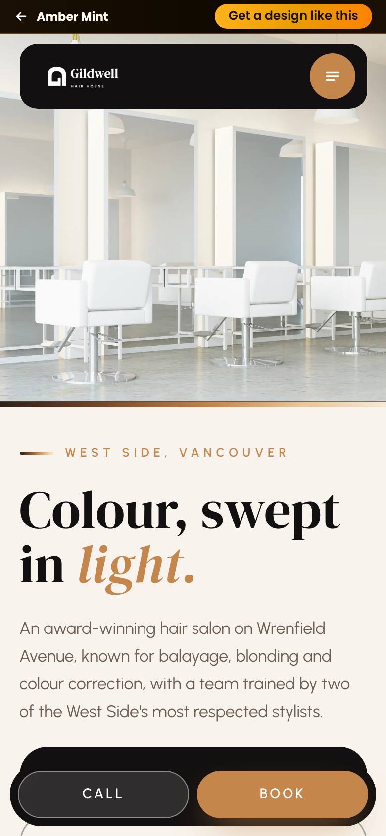
Gildwell Hair House
Balayage, head spa and booking, all swept into one calm page
A warm caramel and espresso homepage design for a colour-focused hair salon with two side-by-side spaces. A refined serif and bright salon photography lead every section, a fanned gallery shows colour work at a glance, and a step-by-step head spa ritual explains a new service simply. A sticky header keeps the Book button visible on any phone.
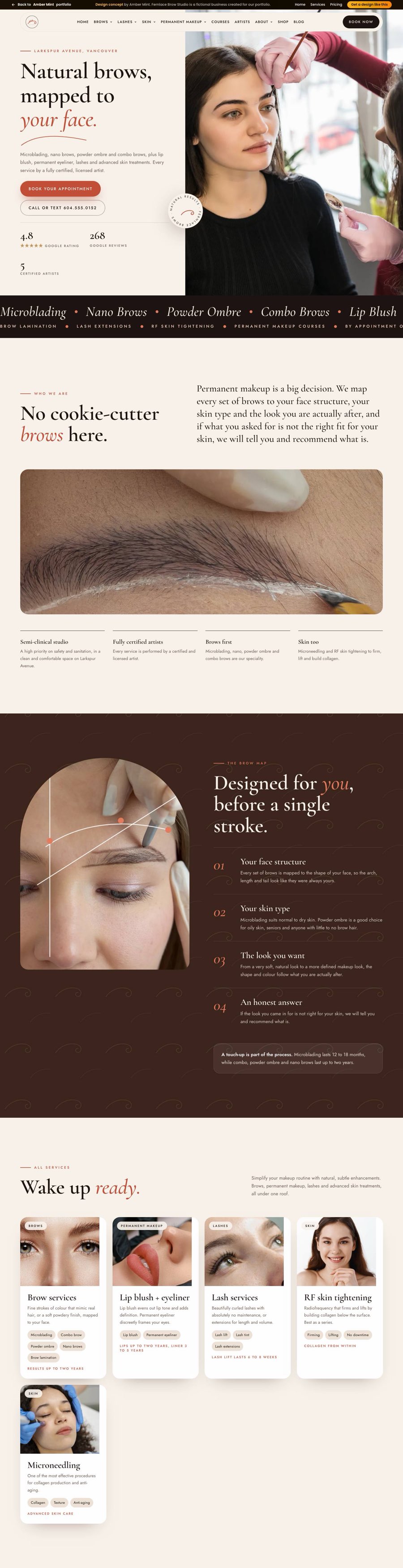
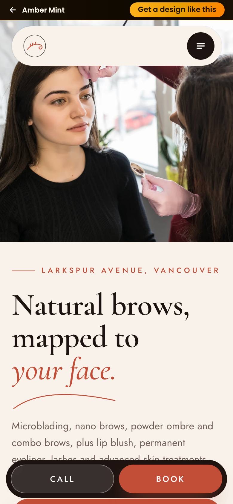
Fernlace Brow Studio
Brows mapped to every face, bookings mapped to every phone
A brow, lash and permanent makeup homepage for Vancouver in studio cream and pigment rose, with a graceful serif and hand-drawn brow curve. A numbered brow mapping story eases first-time nerves, photo service cards explain each treatment without clutter, and clear booking buttons plus a sticky mobile call bar make the next step easy.
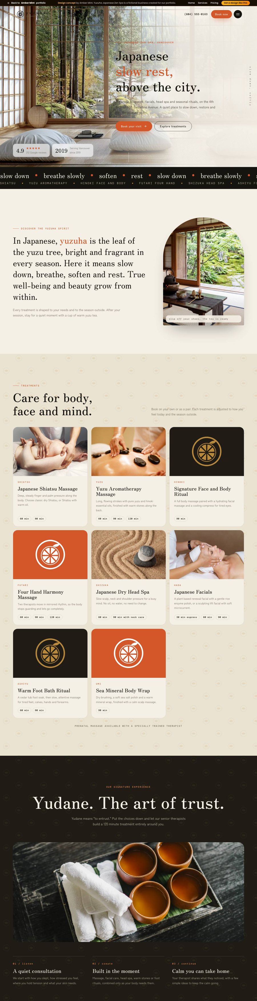
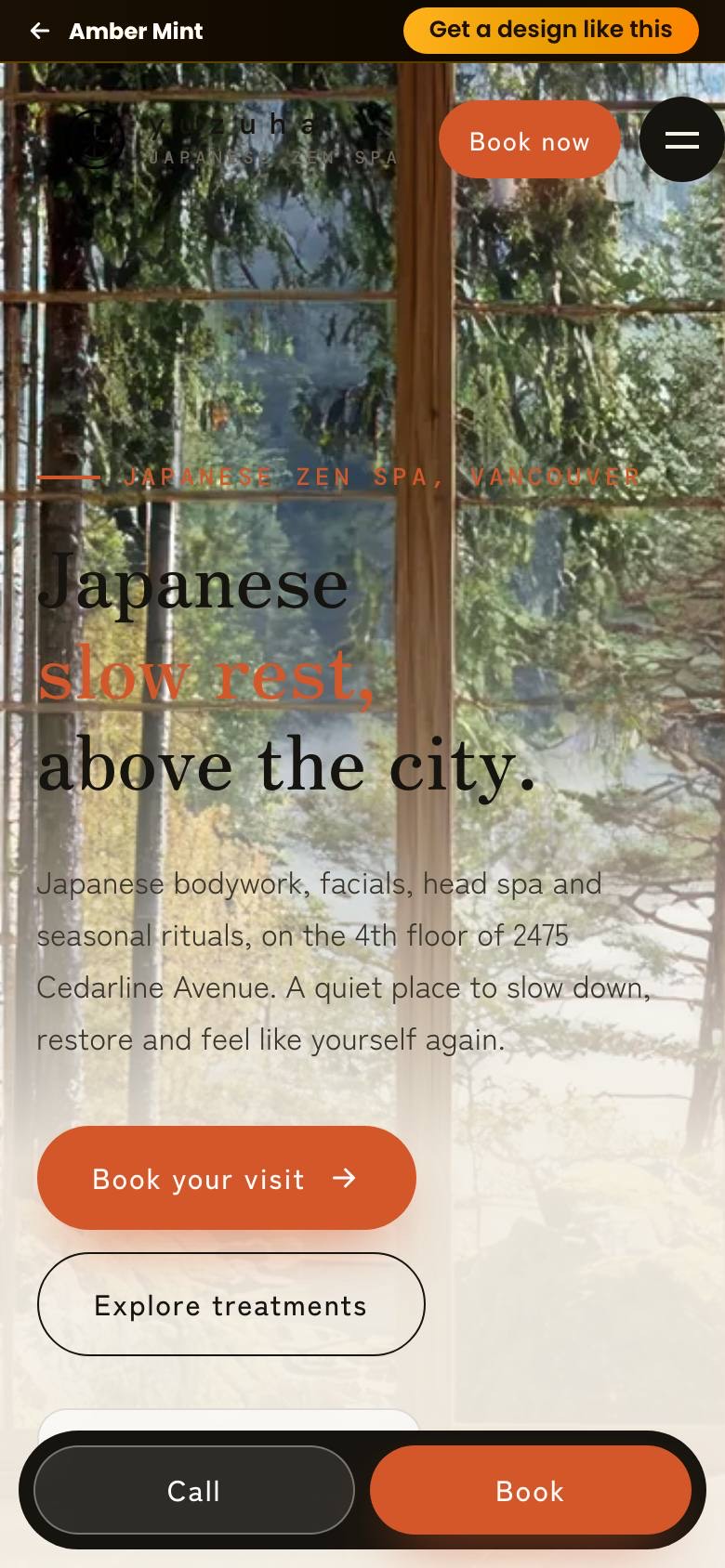
Yuzuha Japanese Zen Spa
Unhurried by design, from first scroll to booked visit
A Japanese day spa homepage for Vancouver that feels like washi paper and ink, with persimmon accents and a quiet serif. Eight treatments sit in a calm card grid with clear session lengths, a signature ritual gets its own dark stage, and a sticky mobile call and book bar keeps the next step effortless.
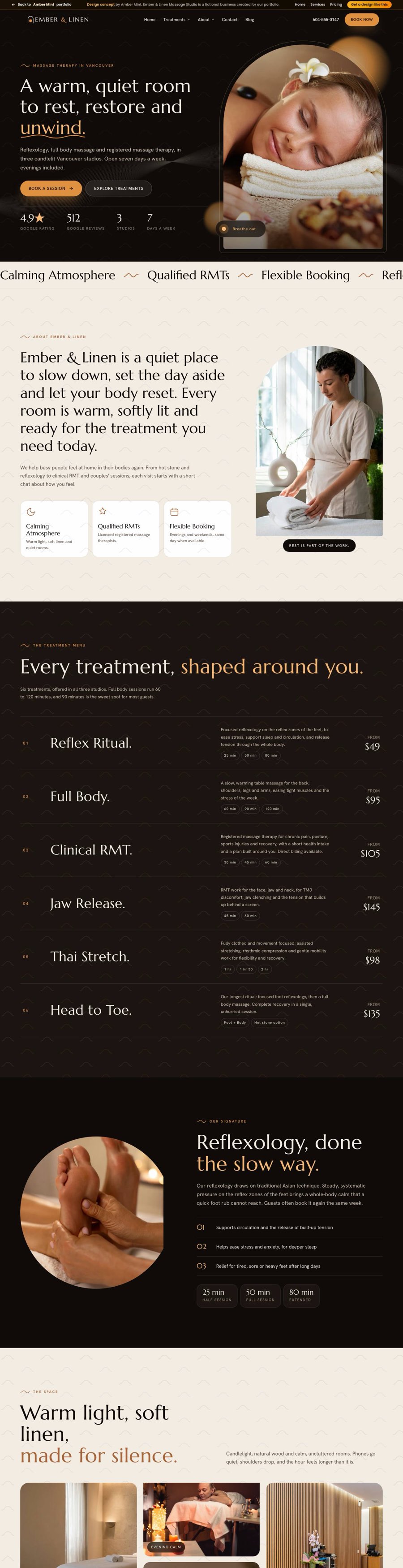
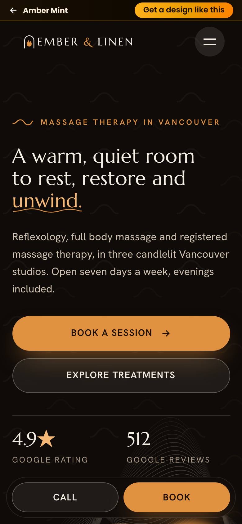
Ember & Linen Massage Studio
A candlelit welcome that turns visitors into booked sessions
A massage and reflexology homepage for a three-studio Vancouver brand, glowing in espresso and amber with an elegant serif. A numbered treatment menu shows every price and session length at a glance, a slow reflexology feature sets the mood, and a sticky mobile call bar with clear booking buttons makes reserving a session simple.
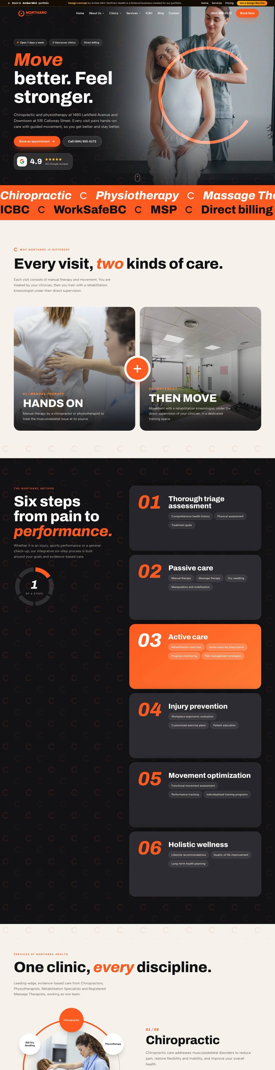
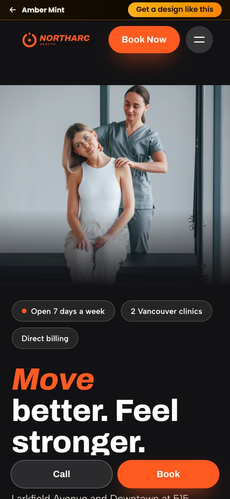
Northarc Health
Hands-on care and guided movement, booked in one tap
A chiropractic and physiotherapy homepage for a two-clinic Vancouver practice, set in charcoal and coral with bold italic athletic type. A six-step method, a services wheel and clear clinic cards turn four disciplines and two sets of hours into one easy story, while a sticky mobile call bar keeps booking one tap away.
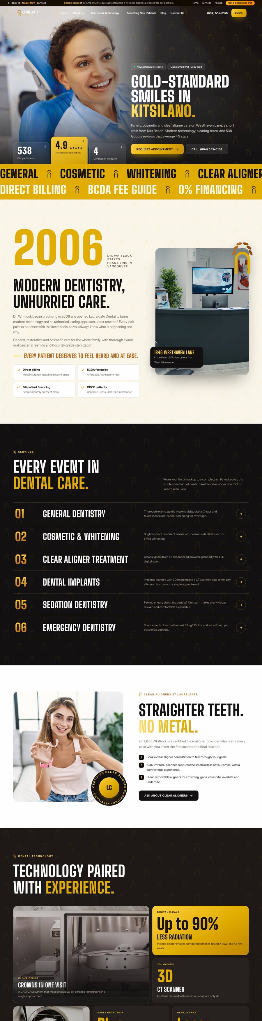
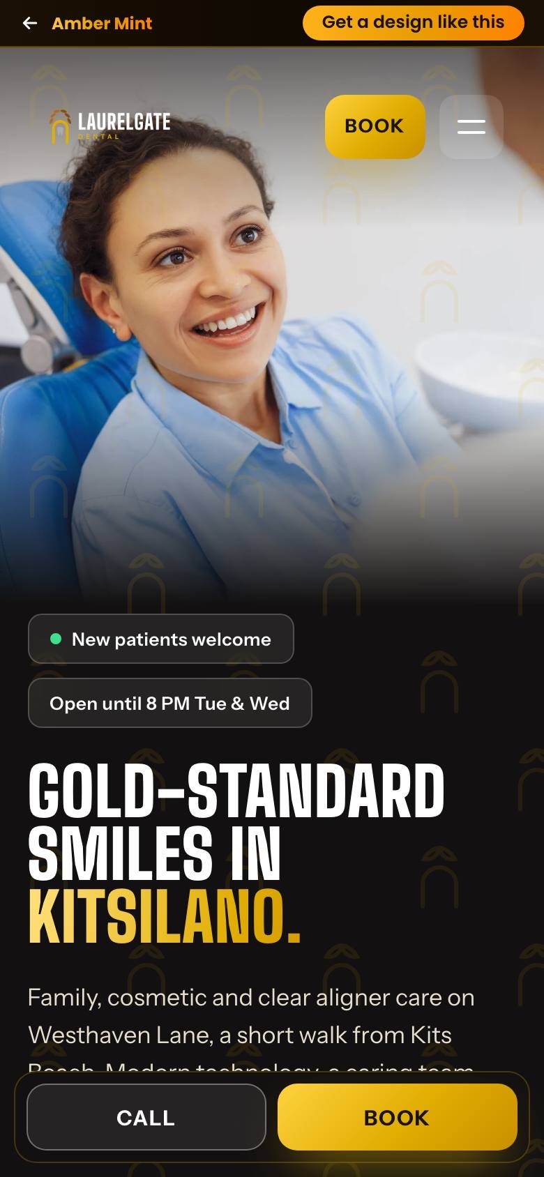
Laurelgate Dental
Gold-standard smiles, built to be booked.
A family and cosmetic dental homepage for Kitsilano in gold and charcoal, with a tall condensed headline face and a laurel and arch mark repeated as a quiet pattern. Six numbered service lanes and a visual hours timeline keep a full range of care easy to scan, while a sticky mobile call bar and clear booking buttons keep the next step one tap away.
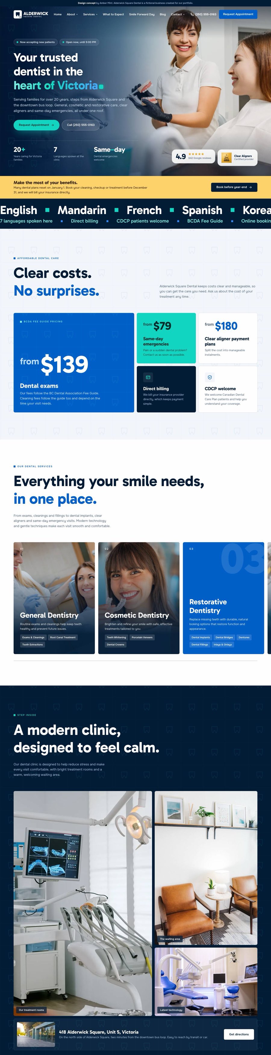
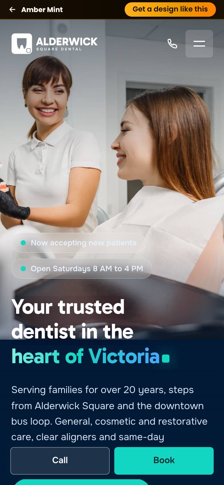
Alderwick Square Dental
Downtown dentistry, squared away.
A family dental homepage for Victoria, built on a city-square grid taken from the logo. A deep navy hero, live opening hours and a bento of clear price cards answer the big questions fast, while services glide past in a pinned track. Bold call buttons and a sticky mobile call bar keep booking one tap away.
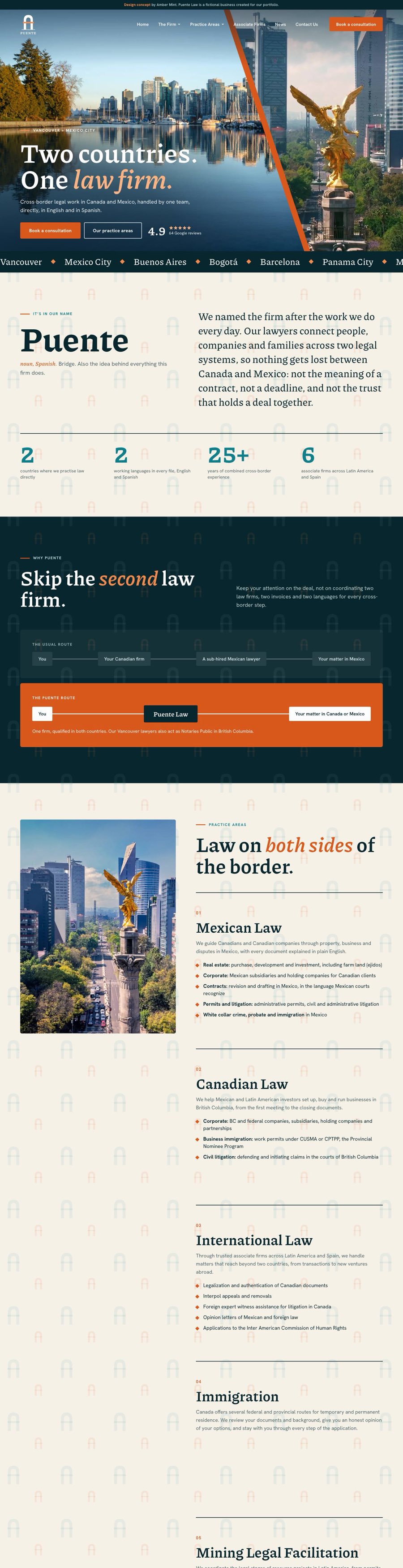
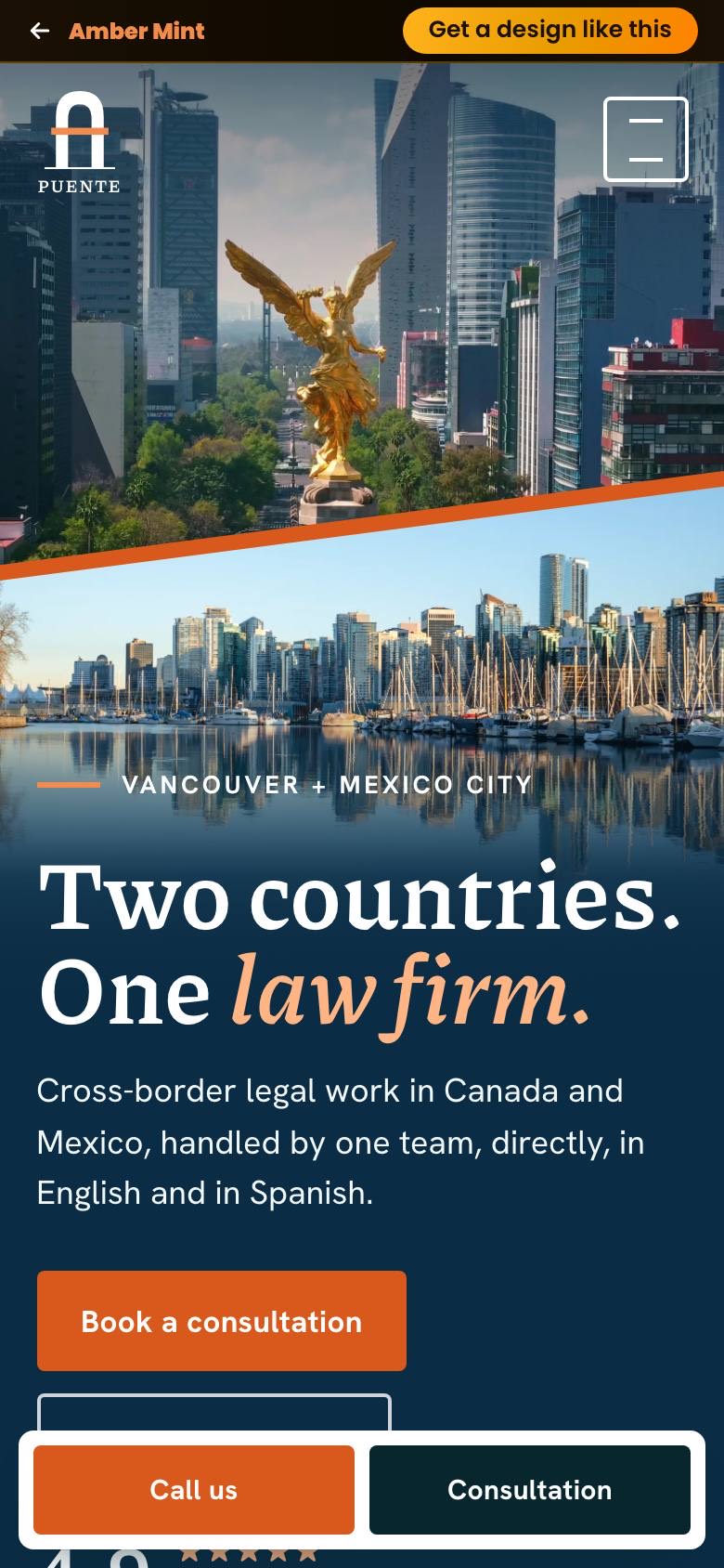
Puente Law
One firm, two countries, zero confusion.
A bilingual homepage for a cross-border law firm serving Vancouver and Mexico City. A split hero joins both skylines along a copper diagonal, five practice areas read as one calm story, and an editorial serif keeps legal detail easy to read. Clear call buttons and a sticky mobile call bar make booking a consultation simple on any phone.
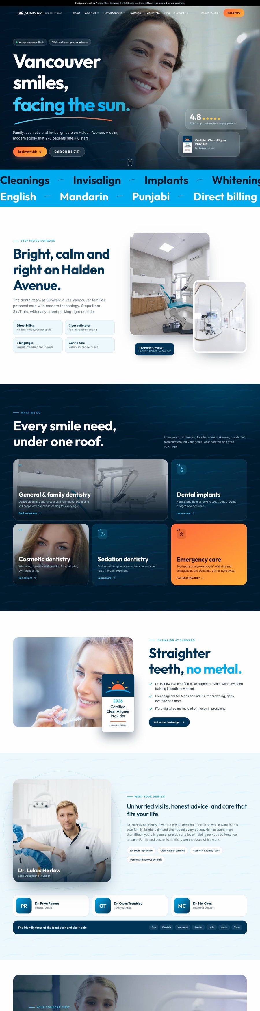
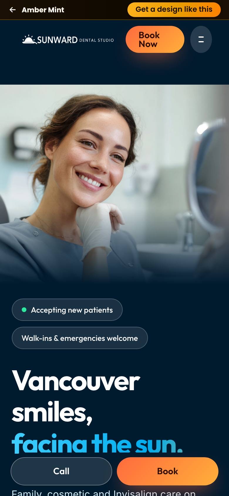
Sunward Dental Studio
A dental homepage that feels like good news.
A bright family and cosmetic dental homepage for Vancouver, with sunrise gradients, friendly geometric type and calm deep-blue sections. Checkups, implants, cosmetic care, sedation and emergency visits each get a clear card, so nervous patients find their answer fast and book in one tap.
Shown as homepage design concepts: business names, logos, addresses and contact details are fictional, and photos are licensed stock. The design, layout, writing and motion are Amber Mint work, and every one can be built for your business.
What goes into every homepage.
The same four things happen on every project, whatever the industry.
Know the customer
We study who you serve and what makes them choose, then plan the page around that decision.
Design that builds trust
Clean layouts, bold type, real-feeling photos and your brand colours, sharpened.
Motion with purpose
Smooth, subtle animation that guides the eye to your services and your call to action.
Built to convert
Mobile-first, fast and SEO-ready, with call and booking buttons exactly where people look.
Like what you see? Let's design yours.
Custom design, copywriting, licensed images and SEO included. Tell us about your business and we will show you what your homepage could look like.